There are certain movies that don’t just watch; you absorb them. For me, Alex Proyas’ 1994 masterpiece The Crow is that film. It is the visual DNA of everything I love: the intersection of comic book high-contrast noir, 90s industrial grunge, and beautiful, surreal tragedy. It is the visual definition of the “Poetic Dustbin” moniker. It is, from a design and artistic perspective, perfect.
But words often fail to capture the “vibe” of a movie like The Crow. Standard critiques analyze the performance of Brandon Lee (which is haunting and iconic), but they miss the atmosphere. They miss the way the rain-slicked streets reflect the neon lights like ink bleeding into water. That’s why, for this section of The Dark Room, I wanted to showcase my own artistic process: translating that feeling into a physical piece of art.
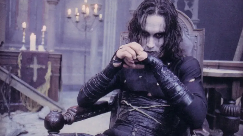
The Ink Vibe
Proyas utilized a monochromatic and desaturated palette that is almost entirely “Navy, Steel, and Rust,” with sudden, violent pops of fire or red. It’s not black and white; it’s high-contrast noir. My process for this piece was about leaning into that structure. I wanted to replicate the sensation of the character—Eric Draven—appearing out of the shadows, built entirely of lines and negative space.
I focused on textures: the wet leather of his trench coat, the smeared, messy makeup that has its own graphic, brutal composition, and the skeletal structures of the buildings he runs across. I used ink on paper, allowing the raw, sometimes unpredictable bleed of the liquid to mimic the rain and chaos of Detroit on Devil’s Night.
Composition from UI/UX Layout
My background in UI/UX informs how I structure my frames. I treated the composition of this drawing as if it were a layout for a mobile app or a cockpit interface. Where is the eye supposed to land? How does the “navigation” flow?
In The Crow, Proyas uses the environment to frame Eric, creating architectural negative space. I did the same in my artwork. Eric is surrounded by vertical lines—the decay of the city—focusing the viewer on his face. The smeared eye makeup is a “design cue,” a call-to-action (CTA) that signals violence and sadness simultaneously. It’s not just a character; it is a system of emotional messaging.
Early Sketches & Ephemera
I always start with raw, quick sketches. They are usually illegible to anyone else—a chaos of “Ink and Bone.” But they are the purest form of the idea. I’ve included one here. This sketch captures the primal shape of the crow symbol and the raw silhouette of Eric before the details were refined. It shows the energy of the concept.
Then, there’s the final piece—a digital “remix.” I took my ink drawings, scanned them, and used a high-contrast digital process to give it that “ink-heavy,” comic-book-on-film feel. It’s a synthesis of practical artistry and digital execution, which is the intersection Critics Canvas is all about. This isn’t just a drawing of the movie; it is a translation of its aesthetic soul.
This is my Rating: ⭐⭐⭐⭐⭐ (5/5)
The Trailer:
Leave a Critique